
The site

The need
A neighbourhood shop does not need a deep website, and building one would work against it. Its customers want three things: is it open, where is it, and is it worth the walk. So the question was never what to add, but how much could be taken away without losing the appetite.
What I did, and why
-
One page, deliberately
Splitting this content across five pages would have added clicks without adding a single piece of information. The single page is not a reduced version of a real site: it is the right shape for this business.
-
Designed for a phone, in the street
The reference case is not a comfortable desktop screen: it is someone standing outside on an average connection, wanting to know whether the shop is open. Eleven of the twelve images only download once you reach them, so the first view stays light.
-
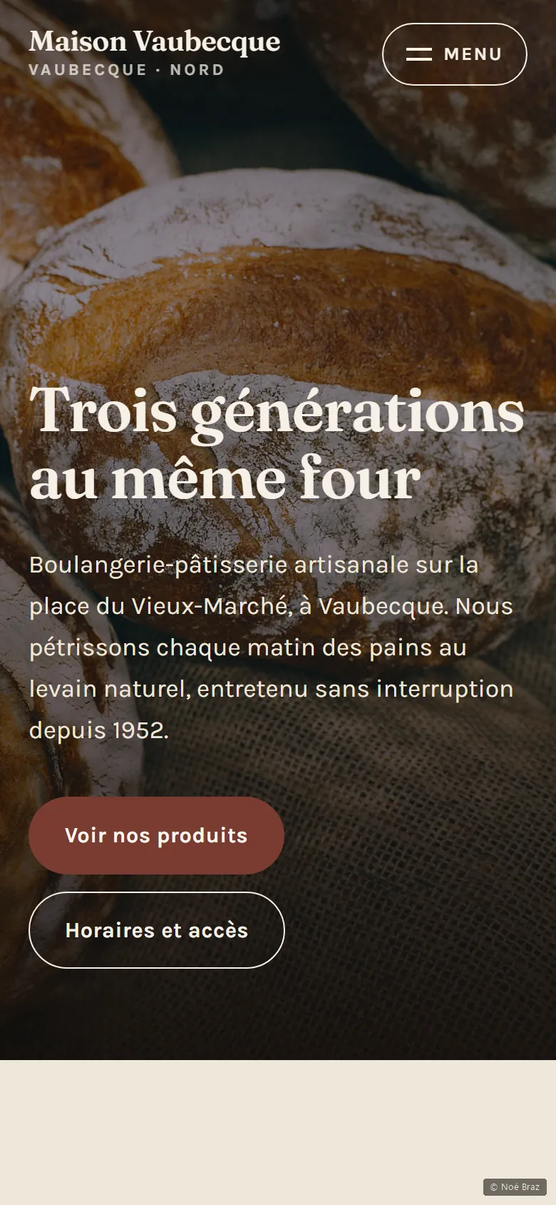
The bread before the logo
The first thing you see is a large photograph of bread, not a brand mark. A baker doesn’t sell their visual identity, they sell what comes out of the oven at seven in the morning.
What I checked
These figures are read automatically from the site, not typed in by hand.
What this project doesn’t do
The photographs come from Unsplash and do not show a real bakery. On an actual commission that would be the first thing to replace: a photo of the real counter beats a beautiful generic image.