
The site

The need
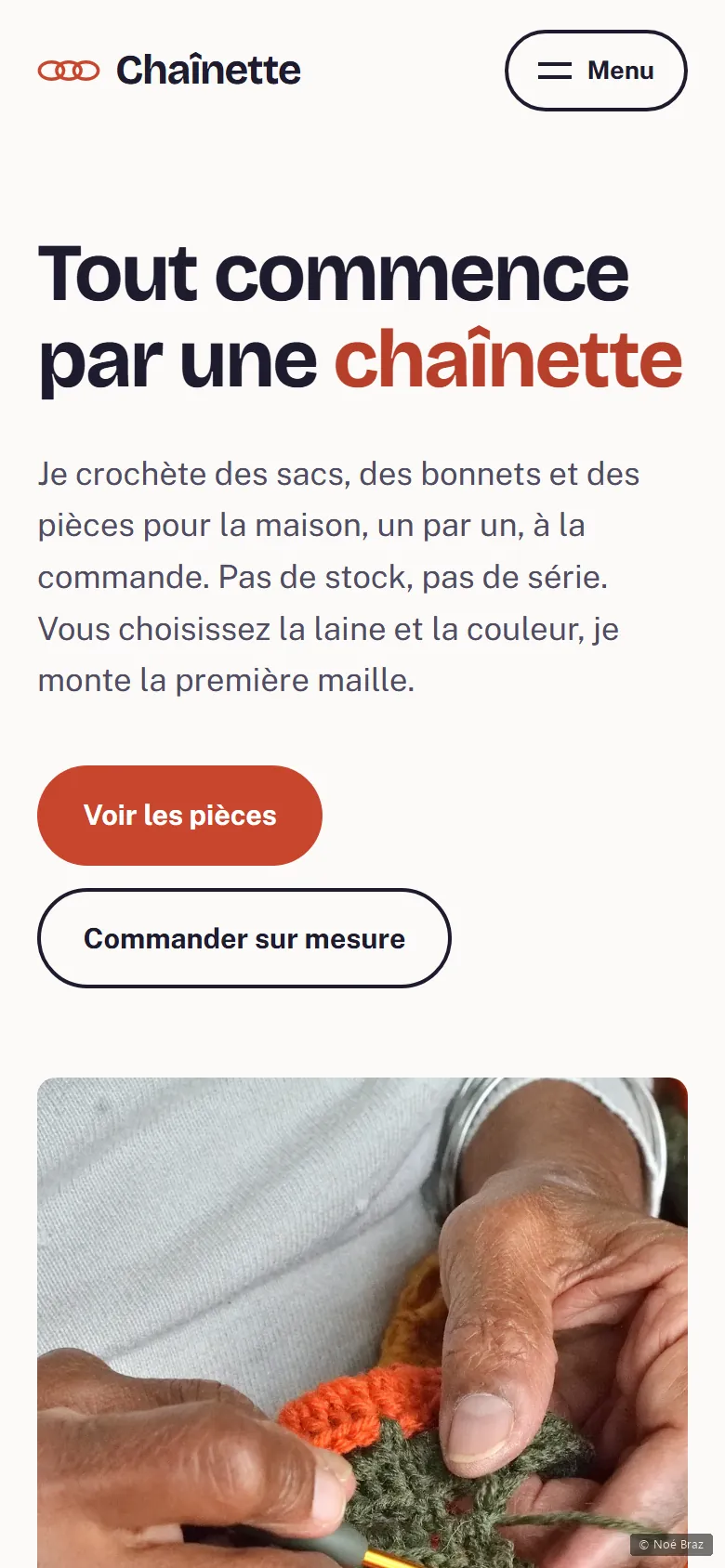
A brand not yet launched, whose founder had not decided whether to launch it. A site showing a final name, a final palette and final copy would have locked her into choices she had not made. The real problem was not the graphics: it was building something finished that could still be picked up and changed without undoing it all.
What I did, and why
-
The whole identity in a single file
The name, the colours and the typefaces live in a file separate from the rest of the styling. Changing the brand name, or moving from coral to green, touches nothing else. A companion file spells out in plain words what is provisional.
-
No faces, no invented testimonials
There is no photograph of the maker and no customer review. Inventing a testimonial for a brand that has no customers yet is a lie, even on a prototype, and it turns against her the day someone notices.
-
The site says out loud that it is a prototype
A discreet banner states it on the page itself. Removing it on launch day is easier than explaining to someone, in the meantime, that what they are reading is not true yet.
What I checked
These figures are read automatically from the site, not typed in by hand.
What this project doesn’t do
The name, the prices and every line of copy are proposals meant to be replaced. The photographs come from Unsplash: none of them shows a piece that was actually made.