
The site

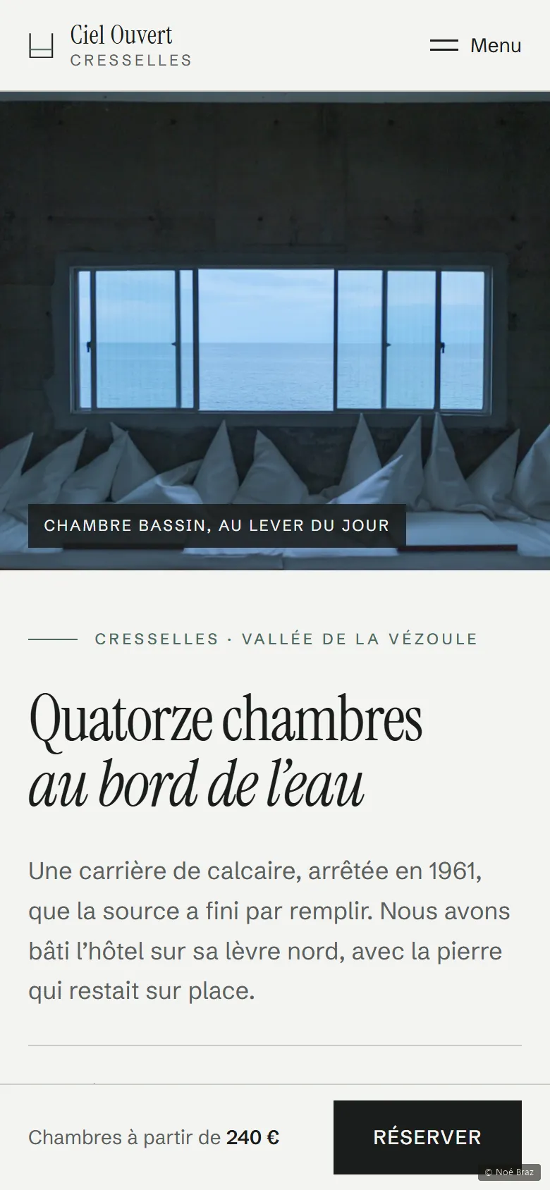
The need
A hotel has to do two things that pull against each other. Make a place desirable, which asks for slowness, photographs and storytelling. And take bookings, which asks for dates, prices and as few clicks as possible. A site that only does the first is a brochure; a site that only does the second is a form. Both had to fit across fourteen pages without one spoiling the other.
What I did, and why
-
A price changes in exactly one place
The same rate appears on the room page, in the room list and in the booking summary. One data file feeds all three. That is the difference between changing a price and hunting for the copies you forgot, and it is the first thing that breaks on a hand-maintained site.
-
On dark sections, redefine the base colours, not the rules
Dark sections don’t rewrite every rule: they give new values to the base colours, and everything inside inherits them, including anything added later. Without that, you reuse a colour measured on a light background without thinking, and the text becomes unreadable. That is precisely the mistake I had made on an earlier project.
-
No rounded corners, anywhere
The hotel sits on the edge of a limestone quarry. Stone there is cut, not polished. Not one corner on the site is rounded, without exception. A constraint held to the end produces a coherence that no single detail can.
-
No postcode, because none could be invented
The first postcode chosen for this imaginary village turned out to belong to a real one. Unlike phone numbers, where a range is reserved for fiction, nothing of the kind exists for postcodes. The only honest option was to show none at all. A small thing, but it is the kind of small thing that sends someone else’s post to a real address.
What I checked
These figures are read automatically from the site, not typed in by hand.
What this project doesn’t do
The booking path runs as far as the summary and stops there: no payment, no real availability, no confirmation email. It is an interface demonstration, not a booking engine.